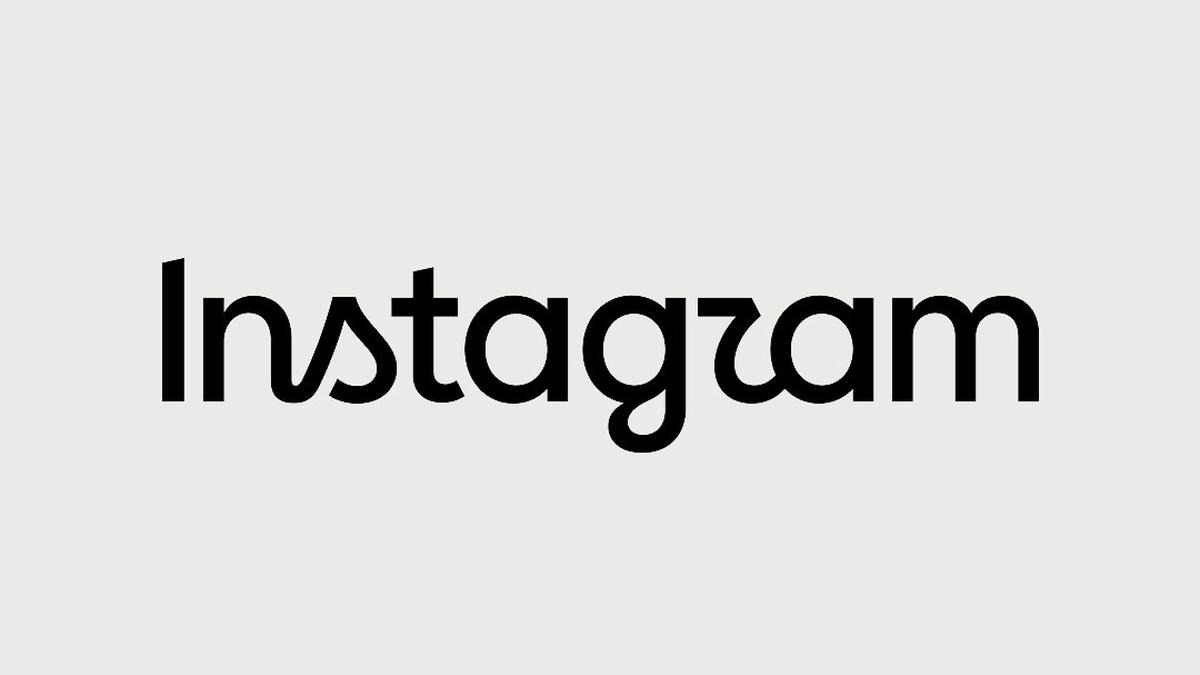
Instagram Gives Its Logo A Fresh Touch
Instagram has quietly updated its wordmark logo, giving the familiar brand lettering a slightly refreshed appearance while keeping the overall identity recognizable. The change may look small at first glance, but visual updates like this can matter a lot for a platform used by millions of people every day. Instagram continues to adjust its branding as the social media platform grows beyond simple photo sharing and moves deeper into video, messaging, creators, and digital communities.
The updated wordmark does not completely replace the identity people already know. Instead, the change appears focused on refining the lettering and making the brand feel more modern across different digital environments. That approach makes sense because Instagram now appears across phone screens, websites, advertising campaigns, creator tools, business profiles, and countless other digital surfaces.
For regular users, the difference might be difficult to notice immediately. Still, the updated Instagram wordmark logo represents another small step in the company’s broader visual evolution.
Why The Wordmark Change Matters
A wordmark is more important than simply displaying a company name in a particular font. It becomes part of the visual memory people associate with a brand, especially when that brand has billions of interactions happening around it every day.
Instagram’s familiar lettering has been connected with its identity for years, making even small changes potentially noticeable among designers, marketers, creators, and social media users. The latest adjustment appears designed to make the wordmark cleaner and more adaptable without throwing away the recognition built around it.
This kind of branding update can also help a company maintain consistency across newer products and services. Instagram is no longer only about square photographs and carefully edited feeds, so its visual identity needs to work across a much wider digital ecosystem.
A Small Change With Bigger Meaning
The interesting part about the Instagram logo update is that it does not feel like an attempt to completely reinvent the company. Instead, the change seems much more restrained and deliberate, which is becoming common among major technology brands.
Companies often refresh logos when their products, audiences, or business priorities have changed significantly. A subtle wordmark adjustment can communicate that a brand is evolving while avoiding the confusion that comes with a dramatic redesign.
Instagram has already gone through several important visual changes throughout its history. Its colorful camera icon became one of the most recognizable social media symbols, while its broader branding gradually became more flexible for modern digital experiences.
The refreshed wordmark follows that same general direction, rather than moving away from the identity users already understand.
Instagram Branding Keeps Evolving
The Instagram brand has changed considerably since the platform first became popular. Earlier versions were strongly associated with photography, filters, and the classic camera symbol. Today, the platform has a much wider focus involving short-form videos, creators, direct messaging, shopping features, recommendations, and entertainment.
That expansion creates a branding challenge because the company needs an identity that feels relevant across many different experiences. A wordmark that works beside photographs may also need to look equally comfortable beside videos, advertisements, creator content, and business features.
The latest update can therefore be viewed as part of Instagram’s wider visual development rather than an isolated logo modification.
What Users Will Actually Notice
Most everyday users probably will not experience any major difference while using the Instagram application. The core interface, account system, posts, messages, and content discovery experience are separate from the visual changes made to the wordmark.
People who spend more time around branding, social media marketing, or design may notice the updated lettering sooner. Businesses using Instagram for promotion could also see the refreshed branding appear in official materials and platform-related communications over time.
For creators, however, the practical impact should remain very limited. The update does not automatically change how Instagram content is created, published, discovered, or monetized.
It is primarily a visual identity adjustment rather than a major product feature.
Why Brands Prefer Subtle Logo Updates
Large companies generally have a reason to avoid making dramatic changes too frequently. Their logos already exist across millions of websites, advertisements, applications, products, documents, and marketing campaigns.
A complete redesign can therefore become expensive and confusing. Customers may also wonder whether the company itself has changed when the logo suddenly looks completely different.
Subtle logo updates provide another option. Designers can adjust typography, spacing, proportions, or other visual details while preserving the recognizable foundation of the brand.
Instagram’s latest wordmark change fits naturally into this approach, because users can still identify the company without needing to learn an entirely new visual identity.
The Role Of Typography In Branding
Typography can influence how people perceive a technology company even when they cannot explain exactly why. Rounded lettering can feel friendly, while sharper typography may appear more technical or serious.
Instagram has historically used visual choices that support its relatively youthful and creative image. The platform serves photographers, influencers, musicians, businesses, artists, celebrities, and ordinary users, so its branding needs to remain approachable across many audiences.
Updating the wordmark gives the company an opportunity to refine that impression without changing the basic personality associated with the platform.
This is one reason seemingly tiny typography changes can attract attention from the design community.
Instagram Faces A Different Social Media Era
The social media environment has changed considerably compared with Instagram’s early years. Users now expect platforms to provide entertainment, video, communication, discovery, and personalized recommendations in one place.
Instagram competes for attention with platforms such as TikTok, YouTube, Snapchat, and other digital services. Because of that competition, branding has become even more important.
A recognizable visual identity helps users instantly understand where an experience is coming from. It also gives creators and businesses a familiar environment where their content can be promoted.
The refreshed Instagram wordmark therefore arrives at a time when the company is continuing to position itself as a broader digital entertainment and communication platform.
What The New Wordmark Could Represent
It would be easy to dismiss the change as nothing more than a different typeface, but brand updates usually reflect something happening underneath the surface. Instagram’s continued expansion into different content formats means its identity has to remain flexible.
The company does not necessarily need another dramatic visual revolution. Instead, maintaining recognition while making the identity feel current can be a smarter strategy.
That balance becomes particularly valuable for a global platform. Instagram needs its branding to work across countries, languages, cultures, screen sizes, and different types of digital advertising.
A carefully refined wordmark can support that flexibility without creating unnecessary disruption.
Will Instagram Change More Elements
There is always curiosity around whether a wordmark adjustment could eventually lead to wider branding changes. However, a refreshed wordmark alone does not automatically mean that Instagram is preparing to replace its entire visual identity.
The company can introduce typography changes independently while keeping other major elements familiar. This approach allows Instagram to modernize its appearance gradually instead of forcing users to adjust to several changes simultaneously.
Future branding updates could happen as the platform continues developing, but users should avoid assuming that every small visual adjustment signals a major redesign.
For now, the wordmark itself remains the most interesting part of the update.
What This Means For Businesses And Creators
Businesses using Instagram for marketing should not need to make immediate changes simply because the platform has refreshed its wordmark. Existing campaigns, social profiles, and content strategies can continue normally unless Instagram provides specific brand-use instructions.
Creators also do not need to redesign their content around the new typography. The more important issue remains how audiences respond to content, how consistently creators communicate their identity, and how effectively businesses reach their intended viewers.
Still, marketers should keep an eye on official Instagram branding resources when preparing advertisements or promotional material. Using the correct current brand assets can help businesses avoid outdated visual elements in future campaigns.
Final Thoughts On Instagram’s Logo Update
Instagram’s refreshed wordmark may seem like a tiny design change, but it reflects how major digital brands continuously adjust their identities for changing audiences and technologies. The platform has moved far beyond its original photography-focused image, and its branding now needs to support creators, video, messaging, businesses, entertainment, and global communities. A subtle wordmark update allows Instagram to look more current without losing the recognition built over many years. For users, there is little practical disruption, but for marketers and designers, the change offers an interesting look at how modern technology brands evolve visually. Keep watching Instagram’s official announcements and branding updates for further changes, and use the latest approved assets whenever your business or creative work features the platform.